Project Description
contour cut wall decals – Stratacon, Melbourne
This installation of contour cut wall decals for construction industry recruiters, Stratacon (Melbourne), has two parts.
meeting rooms
In Stratacon’s Melbourne office they wanted a cost effective solution to add interest to their meeting rooms. These spaces are regularly used to meet with cadidates who are interviewing for positions. The meeting rooms needed to have a friendly welcoming feel. They needed to look smart and professional as they are public facing spaces. Stratacon also wanted the rooms to reflect and relate to the construction industry.
The meeting rooms are situated next to each other. They are both glazed spaces and visible from outside. Therefore the rooms needed to relate to each other and have a common theme.
The first room has a stylised image of the Melbourne skyline. Iconic Melbourne buildings are interspersed with more generic office block images. These images represent the broader architectural and building industry Stratacon works within. The glazing on this room already had a privacy film applied. In order to work with that film the wall decals were applied higher on the wall so the image began at the lower edge of the privacy film.
The second meeting room is designed as a view from a construction site. You can see some generic office buildings in the skyline of this image. There is a crane included in this graphic to represent the construction industry aspect of their business. There are safety rails just as there would be on a real construction site. The image goes from floor to ceiling to give you an immersive experience.
Both of these rooms are now great icebreakers for candidates when they interview. They have become interactive talking points rather than bland, generic meeting rooms. They have become representative of the company.
technical stuff
All of these images are contour cut and applied onto white walls. That means that each ‘gap’ you can see in these images was cut and pulled out by hand and the background is the wall itself. This attention to detail is what makes the finished installation so unique and perfect.
The design used Stratacon’s company colours – orange and grey – to ensure consistency of branding across the company.
reception area
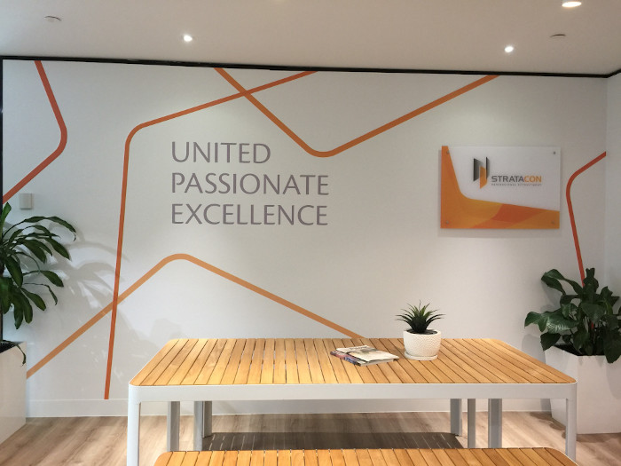
This project started with a glass panel fixed on the wall with the company logo on it. The rest of the glass panel was empty. The glass couldn’t be moved or removed, it had to become an integral part of the new design.
This wall is the first thing people see as they enter the building. It had to look great and create the right impression with visitors immediately. The wall solution had to be representative of Stratacon. The Stratacon team wanted their values to be visible to everyone who visited their offices. The wall solution had to also visually unify the space.
the wall solution
Walls That Talk took lines from the company logo and enlarged them. These were then used to create the graphic elements of the wall design. Then the text aspects representing the values were applied. It is designed as a simple and minimal response. A response that doesn’t compete with the logo but adds to the whole space. The colours are the corporate colours of Stratacon and serve to enliven and unite the whole reception area.
Does your office need a bit more pizazz? Are you wanting to make your client facing areas more representative of your business and values? Contact us now for a quote and lets see how we can help your business shine!


